MEDIA KIT
Official assets, colors, typography, and brand guidelines for press and creators.
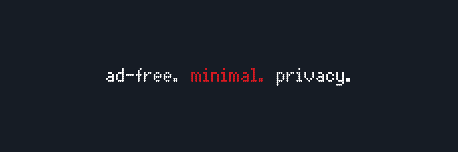

Colors — Light Theme
Colors — Dark Theme
Typography
NDOT57Display / Headings
ABCDEFGHIJKLM
NOPQRSTUVWXYZ
0123456789
Geist MonoBody / Labels
ABCDEFGHIJKLM
nopqrstuvwxyz
0123456789
Font Sizes
xs11px
sm13px
base15px
lg17px
xl20px
2xl24px
3xl28px
4xl34px
5xl48px
Border Radius
xs
6px
sm
10px
mdinputs, buttons
14px
lgcards
18px
xl
22px
fullpills
9999px
Component Specs
Input48px14pxGeistMono 15px
Button48px14pxGeistMono Bold 15px
Chip28px10pxGeistMono Medium 13px
Cardauto18px—
Modalauto18px—
Animations
Fast150ms ease-in-out
Normal250ms ease-in-out
Slow350ms ease-in-out
Button pressscale(0.97)
Chip pressscale(0.95)
Spring damping20
Spring stiffness300
Guidelines
Keep it minimal
Use whitespace generously. Every element should have a purpose.
High contrast
Ensure text is always readable. Prioritize clarity over style.
Monospace everywhere
Body text uses Geist Mono. Headings use NDot57. No exceptions.
×
Don't distort
Never stretch, rotate, or alter the logo proportions.
×
Don't mix fonts
Stick to the type system. No serif or sans-serif substitutes.